Notes on Resume Structure: Visual Architecture and Emotional Temperature
A recruiter's honest notes on how the layout, density, and emotional texture of a resume make us subconsciously simulate what it would feel like to work with you.
When I’m screening a long queue of candidates, I’m not just parsing data points; my brain is constantly running this quiet, subconscious simulation of what it would actually feel like to sit in a room and work with you. Resumes have an *emotional temperature*. Some files feel calm, stable, and highly credible before I even process the actual achievements. Others feel incredibly frantic, loud, and chaotic—like someone is standing in front of me waving their arms and shouting their qualifications. It sounds strange, but that visual aggression triggers an immediate emotional resistance in a tired reviewer, and we start looking for reasons to close the tab.
There is a deep seniority signal in what I call the *confidence-to-noise ratio*. High-level professionals understand the power of *trust through restraint*. They don't feel the need to cram every single project, methodology, and minor certification onto the page to prove their worth. When a resume has a low confidence-to-noise ratio—packed to the margins with excessive proof, twenty different bullet points, and highly polished keywords—it subliminally signals insecurity. It feels like overcompensation. It’s as if the candidate is terrified that if they leave out one single acronym, they won't look qualified. The calm, quiet resumes are always the easiest to trust because they let the real scope of the work breathe.
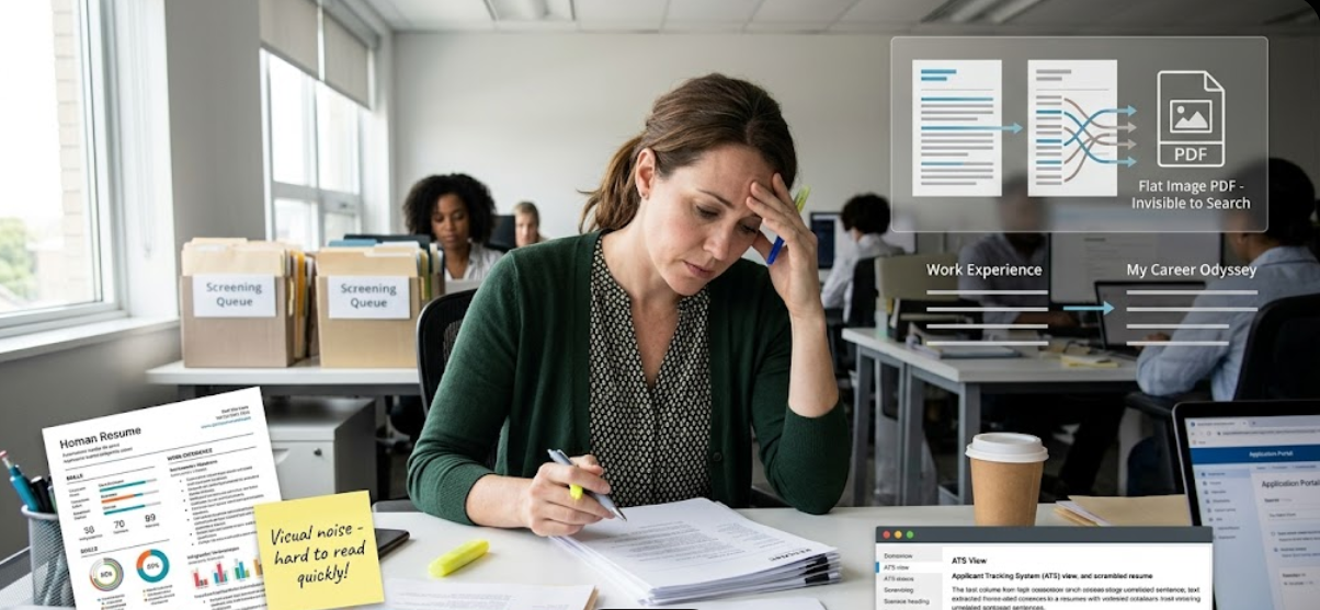
Sourcing under high-volume pressure is also about *reading momentum*. My eyes want to flow naturally down the page in a linear, comfortable rhythm. But when a layout is visually aggressive—full of complex multi-column structures, bold text on every other word, and rating bars for skills—that flow gets completely broken. It creates immediate *emotional friction*. I have to manually choose where to look and decide how to parse the timeline. Under dry-eye screen fatigue, that visual chaos feels exhausting. It breaks the believable writing rhythm. Sourcing managers don't reject creative layouts because we hate design; we reject them because they interrupt the subconscious trust that a clean, linear, and predictable visual architecture naturally builds.
The files that actually stick in my memory aren't the ones that look like hyper-optimized, machine-generated career products. We are highly sensitive to emotional texture. When a resume reads like a flawless corporate manifesto with zero rough edges, it feels artificial. But when there is a sense of *believable imperfection*—a quiet, straightforward description of how a project actually failed and how the team adapted—it builds immediate credibility. Sourcing is a quick visual risk assessment done by tired people. The candidates who make it through the queue are the ones who simply respect the reader’s energy, keep the emotional temperature cool, and tell a believable story.
In the end, screening isn't a precise science; it's a quick risk assessment done by tired people looking at bright screens all day. The files that actually get calls are the ones that simply remove the friction and tell a clear, honest story.