The Problem with Your Resume isn't You—It's How it's Being Read
I’ve spent years looking at the backend of hiring systems. Here is the unfiltered reality of why good candidates get lost in the shuffle and how you can actually stand out.
The most common advice you’ll hear is to "optimize for the bot." It makes it sound like there’s some sentient AI judging your career choices, but the reality is much more boring—and more frustrating. Most big companies use systems like Workday or Taleo, which are essentially just giant, glorified spreadsheets. When you upload your resume, these systems try to "strip" the text and fit it into boxes. If your resume has a fancy layout, the software gets confused, and instead of a professional profile, the recruiter sees a mess of broken characters and missing dates.
I recently saw a Senior Engineer’s application for a lead role at a fintech firm. On paper, he was perfect. But because he used a nested table to list his AWS certifications, the parser skipped that entire section. To the recruiter searching the database for "AWS Certified," he didn't even exist. This is what we’re up against. It’s not about being "perfect" for a machine; it’s about making sure your hard work is actually visible when someone hits the search bar.
The "Invisible" Formatting Traps
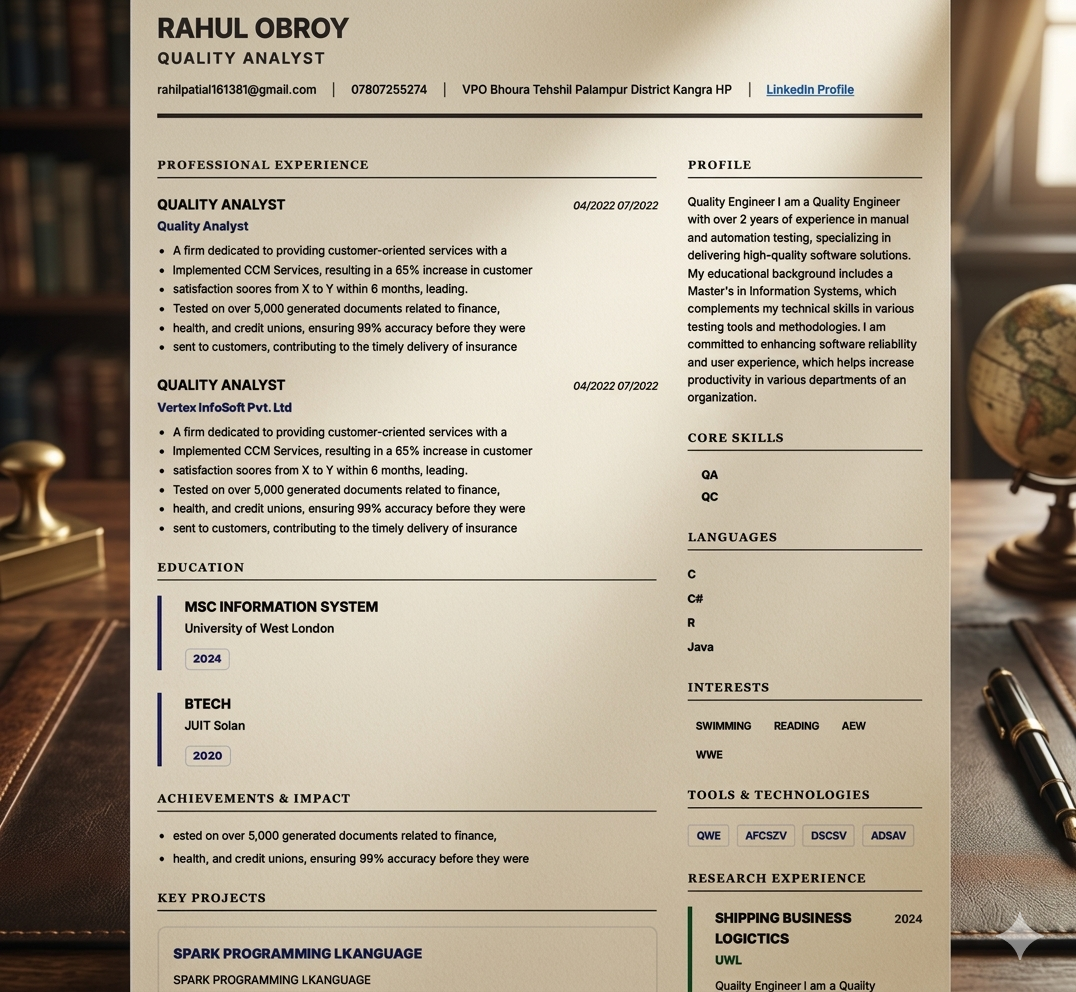
We love two-column resumes because they look modern and clean. However, legacy parsers read left-to-right across the entire page. They don't see the vertical line you’ve drawn. So, if your contact info is in the left column and your summary is in the right, the system might merge the first line of both. Suddenly, your phone number is mixed into your professional summary. I’ve seen hundreds of profiles where the "Job Title" field was just a random string of contact details because of a simple column error.
Another silent killer is the "Header" and "Footer" in Word. Most recruitment software ignores these sections entirely. If you’ve put your name and email in the header to save space, there’s a high chance the system sees a resume with no owner. It’s a small technicality that can end an application before it even begins.
Stop Guessing with Keywords
There's a lot of talk about "keyword stuffing," and frankly, it’s bad advice. Recruiters aren't stupid. They see the raw text that the system extracts. If they open your profile and see a paragraph of 50 technical terms hidden at the bottom, it kills your credibility instantly.
A better approach is what I call "Contextual Search." If a job asks for "Agile Leadership," don't just put that phrase in a list. Write a line about how you actually did it. For instance, instead of just "Managed a team," try something like "Led a team of 8 through 15 successful sprints, delivering the beta version three weeks early." This gives the machine the keyword it wants, but more importantly, it gives the human recruiter a reason to keep reading.
The 6-Second Reality
Let’s say you pass the technical filter. Now a human is looking at your resume. You have exactly six or seven seconds to catch their eye. This is where most people fail by being too vague. I see so many resumes that say "responsible for managing budgets." That tells me nothing. Did you manage a $500 budget for office snacks, or a $5 million budget for a global marketing campaign?
Specifics are your best friend here. Use numbers, percentages, and hard facts. If you improved something, by how much? If you saved time, how many hours a week? These are the "anchors" that a recruiter’s eye naturally gravitates toward during that initial 6-second scan.
Try the "Notepad Test" Yourself
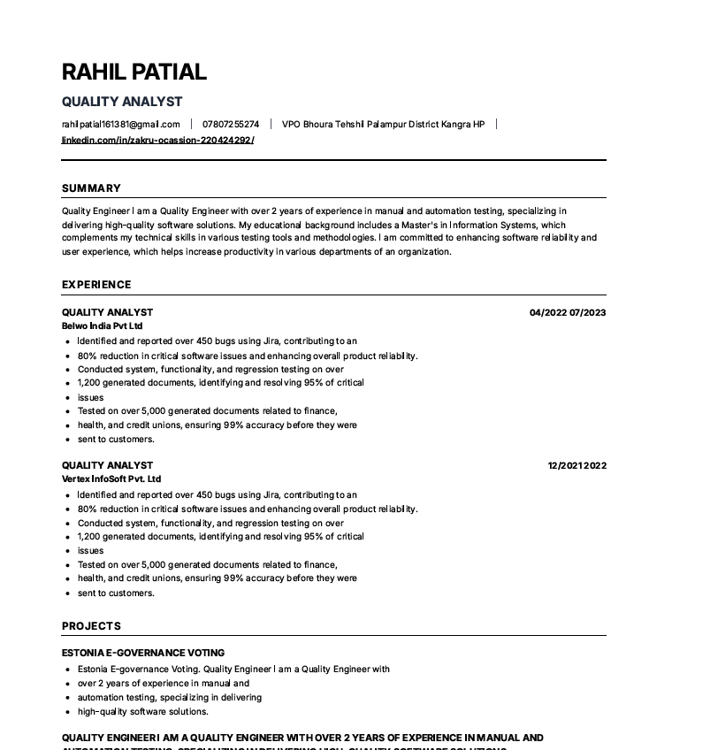
If you’re unsure about your resume’s health, there’s a dead-simple way to check. Open your PDF, copy everything, and paste it into a plain text editor like Notepad. Look at the result. If the sentences are broken, if your dates are floating in the wrong place, or if your name is missing, you have a problem. This "ugly" text version is exactly what the recruiter sees on their screen before they ever decide to click on your actual PDF. If the text version doesn't make sense, you won't get that click.
Why I Built This Platform
I was tired of seeing incredibly talented people—friends, colleagues, and experts—get rejected because of a formatting technicality. Most resume builders out there focus on making things look "pretty" for Instagram, but they ignore the technical reality of how resumes are actually processed in 2024.
I wanted to build something different. A tool that prioritizes your visibility above everything else. Our templates are intentionally clean and single-column because that’s what works. We don't use flashy graphics that break parsers; we use a structure that is guaranteed to be read correctly by every major system from Workday to Greenhouse. It’s about giving you the best possible chance to actually get the interview.