Observations from the Recruiter's Desk
A look at how we actually read resumes, why flashy templates usually hide your best work, and what gets noticed in a fast sweep.
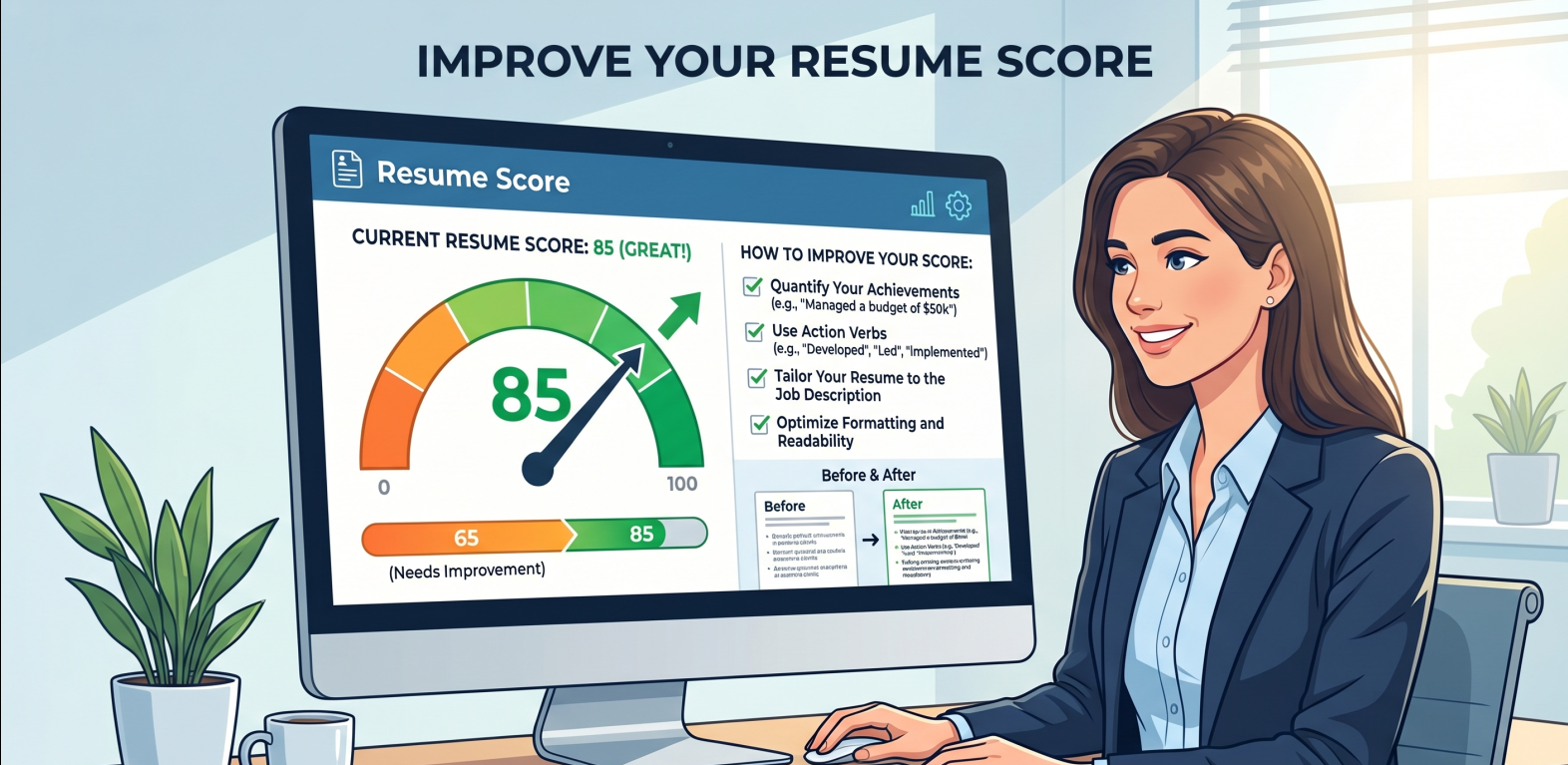
Tuesday Mornings and the Reality of Sourcing
Every Tuesday morning usually starts the same way. I sit down at my desk, open up our company's hiring portal, and stare at a list of about two hundred resumes that came in over the weekend for a single senior developer role. My first task isn't to read them. It is to decide which ones are worth a closer look.
I don't have hours to read each one—that’s just the reality of the workflow. I have about six seconds per page on my first sweep. If your resume is divided into three visual columns, has skill bar graphics showing "80% Python proficiency," or splits my attention with colorful blocks, my eyes have to jump around just to find your basic details.
I am looking for your past job titles, how long you stayed there, and the actual tools you used to solve problems. The clean, single-column documents win because they let me find what my engineering manager is asking for in three seconds flat.
When you deviate from a simple top-to-bottom layout, you are relying on a busy recruiter to spend extra time squinting at your page. In high-volume hiring, most of us just won't.
Tucking Your Best Work in the Margins
Just last week, I was looking for a backend engineer who knew Node.js and had some experience with AWS cloud migration. I knew we had some good candidates in our candidate folder, so I ran a quick search query.
One candidate—I think his name was Mark—had excellent experience at a logistics startup. But he had designed his resume with a heavy grey visual column on the left side, putting all his skills and programming languages inside that shaded block. Because of how our text parser extracts data, that grey column got completely skipped.
He didn't get filtered out because of his skill set; his document layout simply made him invisible to my search filters. It’s a very practical, frustrating thing that happens all the time.
Keeping your contact details and core tools in standard, flowing text is the only way to make sure they actually get read. When you put them inside graphic sidebars or margin blocks, you're rolling the dice.
Side-by-side structures often scramble the reading order, merging unrelated lines of text when imported.
Tucking email addresses or phone numbers inside visual margins often means they get dropped completely.
Drivers, Passengers, and Bullet Points
When I scroll through resumes, I can tell within seconds if someone is a "driver" who actually owned a project, or a "passenger" who just sat in the room while work happened.
I see a lot of resumes where someone lists forty technologies at the bottom of the page in a giant block. To be frank, when I see a massive list of keywords with zero context, I assume you just took a quick course or copied a syllabus. I want to see how you used those tools.
"Responsible for code maintenance and bug fixes."
"Redesigned our checkout flow in React, which fixed a recurring memory leak and helped cut user drop-offs by 15%."
If you are a designer, tell me the exact user flow you redesigned. If you know Agile, tell me how you ran team sprint planning. A single outcome-based sentence tells me everything I need to know.
Recruiter Trade-offs & The Sourcing Reality
There is a big myth that recruiters rely on some perfect automated score to make hiring decisions. In reality, the sourcing process is messy and full of subjective trade-offs. I will gladly pass over a candidate who perfectly matches every keyword if their resume has zero project context.
We look for standard sections because they save us time. When you name your history section "My Professional Chapters" instead of "Work Experience," it just causes confusion. And to be honest, a brief professional summary at the top helps me write my pitch to the hiring team.
A simple vertical document isn't about pleasing an algorithm—it's about making sure your actual achievements aren't hidden behind a visual design that doesn't serve you.
My Simple Checklist Before You Hit Send
Some quick, practical checks I always suggest running before you hit send:
- 1. Make the layout vertical
Keep your text flowing in a single column so sidebars don't scramble the reading order.
- 2. Contact info in body text
Put your phone and email directly on the page, not inside top or bottom margin fields.
- 3. Stick to standard headings
Label your sections clearly as Work Experience, Skills, and Education so they are easy to locate.
- 4. Outcomes over duties
Write down the actual results of your work, like automated tasks or saved hours, using short bullet points.
At the end of the day, my team hires actual human beings, not perfect templates. Keep the design simple, and let your real wins do the talking.
The Simplest Advice Often Wins
Hiring coordinators evaluate your qualifications based on the challenges you've solved, the processes you've automated, and the results you've delivered.
When the layout is clear, your work can stand out on its own.
- Single-column layout only
- Standard header fonts used
- No tools/skills inside margin bounds
- Quantifiable bullet items included