Stop Obsessing Over One Page: The Truth About Resume Length
A well-spaced layout with clear results will always win over a cramped, unreadable format.
Why Readability Matters
The visual flow and legibility that makes an application stand out
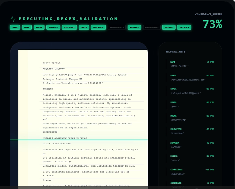
If there is one piece of career advice that causes unnecessary anxiety—and actively hurts applicants—it is the dogmatic rule that a resume must fit on a single page.
Let me be clear: resume length depends entirely on your experience and changes according to your career depth. A recruiter will never reject a strong, well-spaced two-page resume just because it went onto a second page. However, they will immediately skip a single-page resume that uses a tiny size 8 font and zero margins because it reads like a wall of dense gray text. We do not read resumes in physical print isolation anymore. We scroll through PDF files on wide desktop monitors where readability is everything.
The objective is not to hit an arbitrary page count; the objective is conciseness and scannability. If you have five to seven years of experience, attempting to squeeze your entire career history onto one page forces you to make terrible trade-offs. You end up deleting key achievements, omitting project scales, and shrinking margins to a point where your professional progression becomes invisible. The most competitive resumes use exactly as much space as they need to establish direct value for the specific role—and not a single line longer. This means a junior candidate should almost always stay on a single page, while a senior engineer or team leader needs two pages to fully substantiate their impact.
By shifting your focus from the arbitrary page limit to the clear readability of your career wins, you build an application that experienced hiring managers can scan in seconds.
When Two Pages Make Sense
A simple breakdown of resume length and layout expectations based on your real-world experience level.
Strictly 1 Page
At this stage of your career, you are selling potential and direct competence. For freshers, it is much better to write in detail about the targeted job role—focusing heavily on your core knowledge, tool skills, specific tech stack, and practical tool experience. Give prominent layout space to your industry-recognized certifications, hands-on internships, and industrial training courses. This proves you have day-one capability without stretching your page with high school filler.
1 to 2 Pages
This is the transition zone. If you have had three different jobs with genuine achievements and quantifiable metrics, you can confidently go onto page two. However, do not let your resume spill over to a second page just to host three or four lines. If you choose to expand to two pages, ensure the second page is at least half-full. Otherwise, edit ruthlessly and condense back down to a single, high-impact page.
Strictly 2 Pages
If you have over eight years of experience, forcing everything onto a single page is a self-sabotaging mistake. You are applying for roles that require proof of leadership, technical direction, and team management. Shrinking your experience to fit an arbitrary page limit means you are stripping out critical proof of impact. Use two full pages, keeping the most relevant achievements on page one.
Highlighting Strong Professional Experience
If you already possess solid professional experience, your resume's job is to select and frame your major highlights rather than listing daily chores.
When you have a strong foundation of skills and a solid track record, focus the page space on key skills and high-impact bullet points under each company. Make sure to use active, strong action words at the start of every point to immediately drive reader interest, and clearly mention the type of work you did—whether it was full-time, contract, freelance, or remote. Clearly defining the nature of your engagement builds immediate trust with hiring managers.
Rather than listing every minor task you participated in, dedicate your space exclusively to major highlights and business achievements. If you led a high-impact product launch, explain the scope, team size, and the direct technical outcome using precise metrics. This keeps the reading pace fast and ensures that the recruiter is not bogged down by a wall of generic daily responsibilities. For experienced professionals, the bullet points of your last two companies are the most valuable real estate on your entire document. Make sure those points speak directly to your technical leadership, tool expertise, and the strategic problems you solved, leaving secondary administrative duties out entirely.
By emphasizing strong highlights with bold action words and clear work types, you turn your resume into a selective showcase of your highest professional value.
What Recruiters Actually Notice
The famous "six-second scan" is real, but candidates completely misunderstand how it works. It does not mean we discard your resume after six seconds; it means you have six seconds to prove the document is worth reading in detail.
When I open a resume, my eyes follow a highly predictable scanning pattern that focuses on layout headers and dates. First, I check your most recent job title, the companies you worked for, and the impact of your primary responsibilities. If that top third of page one is cluttered or packed with generic lists of daily duties, I will close the file without reading further. You must make your most relevant experience immediately visible at the very top of the screen.
This visual priority is why white space is your most valuable asset during a resume review. A clean layout with 0.8-inch margins and generous separation between sections allows a recruiter's eyes to jump straight to your key metrics without getting lost in a wall of text. When you eliminate margins and pack lines together to force a single-page layout, you create visual fatigue that makes it difficult to find critical information. Recruiters do not read every word on the first pass; they scan for section markers and bold text that matches their hiring criteria. Generous line spacing and clean typography act as clear structural markers, turning a dense history into a readable timeline of your professional career.
Think of your layout as a conversation: if you speak too fast without taking a breath, your listener tunes out—give your achievements the room they need to make an impact.
The "Ruthless Edit"
To keep your length optimized, you must cut the legacy content that modern recruiters ignore. Here is exactly what is eating your valuable page space:
| Wasted Space Item | Recruiter Explanation |
|---|---|
"References available upon request" | This phrase has been obsolete for 15 years. Recruiters already know they can request references, and you will provide them when asked. Deleting this line instantly saves you valuable vertical space at the bottom of your page. |
Vague Objective Statements | "Seeking a challenging position to grow my skills..." Objective statements are selfish and say absolutely nothing useful. Replace them with a sharp, three-line professional summary explaining how you solve problems, or remove the summary entirely. |
Basic/Expected Tools | Listing "Microsoft Word", "Gmail", "Internet Browsing", or "Team Player" as technical skills is a major red flag. In the modern workforce, these are basic assumptions, not competitive skills. They only clutter your page. |
Jobs Older Than 12 Years | Unless you are applying for an executive-level role where your early foundational work is critical, no one cares what technical tools you used in 2011. Summarize early roles into a single-line index, or remove them entirely to focus on your recent work. |
Common Resume Layout Mistakes
Hiring managers spot these formatting errors immediately. Correcting these simple issues will drastically improve your resume's reading flow.
Font Size Shrinkage
Shrinking your body font size below 10.5pt to force all your text onto a single page is a major mistake. It creates severe visual strain and often causes hiring managers to skip reading entirely. Keep font sizes readable.
Zero Margin Layouts
Reducing page margins below 0.75 inches makes your layout feel incredibly cluttered, giving recruiters the impression that you have too much fluff. Generous margin frames make your text look balanced.
The Spillover Disaster
Allowing three or four trailing lines of text to spill onto a second page looks sloppy and poorly planned. Always edit down to one page or expand page two so that it is at least half-full with real achievements.
Double Contact Info Header
Listing full mailing addresses, multiple phone numbers, and outdated social links takes up a massive block of height. Keep contact info restricted to a single-line index of Email, Phone, LinkedIn, and Github.
Let Us Handle the Spacing
Stop tweaking line heights and margins. Our builder formats your resume with clean spacing and margins tailored to your exact experience level.
Frequently Answered
Calm recruiter insights answering the most common formatting and page length questions.
Is a 3-page resume ever acceptable?
Very rarely. Unless you are a highly senior executive with a 20+ year history of C-suite leadership, a technical specialist with a vast list of academic patents and research publications, or submitting a government CV, there is no justification for three pages. For 99% of professional tracks, two pages is the absolute maximum.
Will applicant tracking software (ATS) reject a 2-page resume?
Absolutely not. An ATS does not care about page count because it strips away layout frames to parse raw text. It reads the file as a single stream of characters. Rejections happen due to a lack of keyword relevance, missing skills, or confusing section headers—never because your text flowed onto page two.
Should I shrink my font size below size 10 to fit a single page?
Never. This is the single biggest formatting mistake candidates make. If your resume is hard to read because the font is too small, a recruiter will simply close the file. It is far better to have a clean, beautifully formatted two-page resume with size 11 font and generous white space than a microscopic single page.
What information should go on the second page?
The first page must host your most relevant, high-impact achievements and recent roles, as it is what recruiters see first. The second page is reserved for your earlier professional experience, secondary certifications, academic publications, technical stacks, or volunteer work.
How long should a cover letter be?
Strictly one page. Keep your cover letter between 250 and 350 words, structured in three simple paragraphs. A cover letter should never go onto a second page under any circumstances.